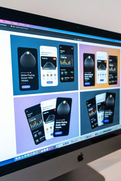
Here's what mobile-first design looks like today—and the best practices you should follow.
Start With Mobile, Expand to Desktop
Designing mobile-first means beginning your wireframes, UI, and UX strategy for smartphones first. This forces you to prioritize content, declutter layouts, and focus on essential functionality before scaling up for tablets and desktops.
Prioritize Performance
Mobile users expect fast-loading experiences. In 2025, the key is to:
- Optimize images and serve them in modern formats like WebP or AVIF.
- Use lazy loading and content compression.
- Minimize JavaScript and avoid unnecessary animations or plugins.
Performance affects both user retention and SEO rankings.
Use Responsive Frameworks
Frameworks like Tailwind CSS, Bootstrap 5, and CSS Grid/Flexbox make it easier to build responsive layouts. Combine media queries with scalable units (like rem, %, or vw) to adapt content to all screen sizes smoothly.
Thumb-Friendly Design
Users navigate with their thumbs—design with that in mind:
- Place buttons, menus, and CTAs within easy reach.
- Ensure tap targets are at least 44x44px.
- Avoid cluttering interactive elements close together.
Simplify Navigation
Mobile users need quick access to key sections:
- Use hamburger menus, tab bars, or bottom navs for compact yet effective navigation.
- Include a persistent back button and easy ways to return to home or top-level sections.
Minimalism is Key
Keep interfaces clean. Strip away anything that doesn't serve a clear purpose:
- Embrace white space.
- Limit font styles and sizes.
- Use color and icons strategically.
Embrace Progressive Web Apps (PWAs)
PWAs offer an app-like experience on mobile:
- Fast loading
- Offline support
- Push notifications
- Home screen installability
They're ideal for delivering powerful functionality without the friction of an app store.
Optimize for Touch & Gestures
Design elements should support natural touch behavior:
- Enable swipeable carousels and drawers.
- Use visual feedback (like ripple effects) on button taps.
- Prevent horizontal scrolling or accidental input zooming.
Test on Real Devices
Emulators are great, but real-world testing is better. Test across various screen sizes, OS versions, and network conditions to ensure reliability.
Design With Accessibility in Mind
Accessibility is a core part of mobile UX:
- Ensure text is legible at smaller sizes.
- Provide sufficient contrast.
- Use semantic HTML and ARIA labels.
- Support screen readers and keyboard navigation.
Conclusion
In 2025, mobile-first design is about clarity, speed, and human-centered thinking. By following these best practices, you're not just building a responsive website—you're delivering a great experience everywhere, for everyone.
Looking to implement a mobile-first approach for your business? Conetdev specializes in mobile-optimized websites and apps that perform. Let's bring your vision to life.
